

Forma
System Icon Set
Forma is a personal icon library, built so I'd always have a consistent, well structured set of icons on hand for my own projects. It's open source, partly to make it genuinely useful to other product designers, and partly because it's a direct demonstration of how I approach systems thinking, consistency, and scale. I use Forma across my own projects, including Bloom and the Forma Design System, both as a practical resource and as proof that the system holds up in real interfaces, not just on a static sheet of icons.
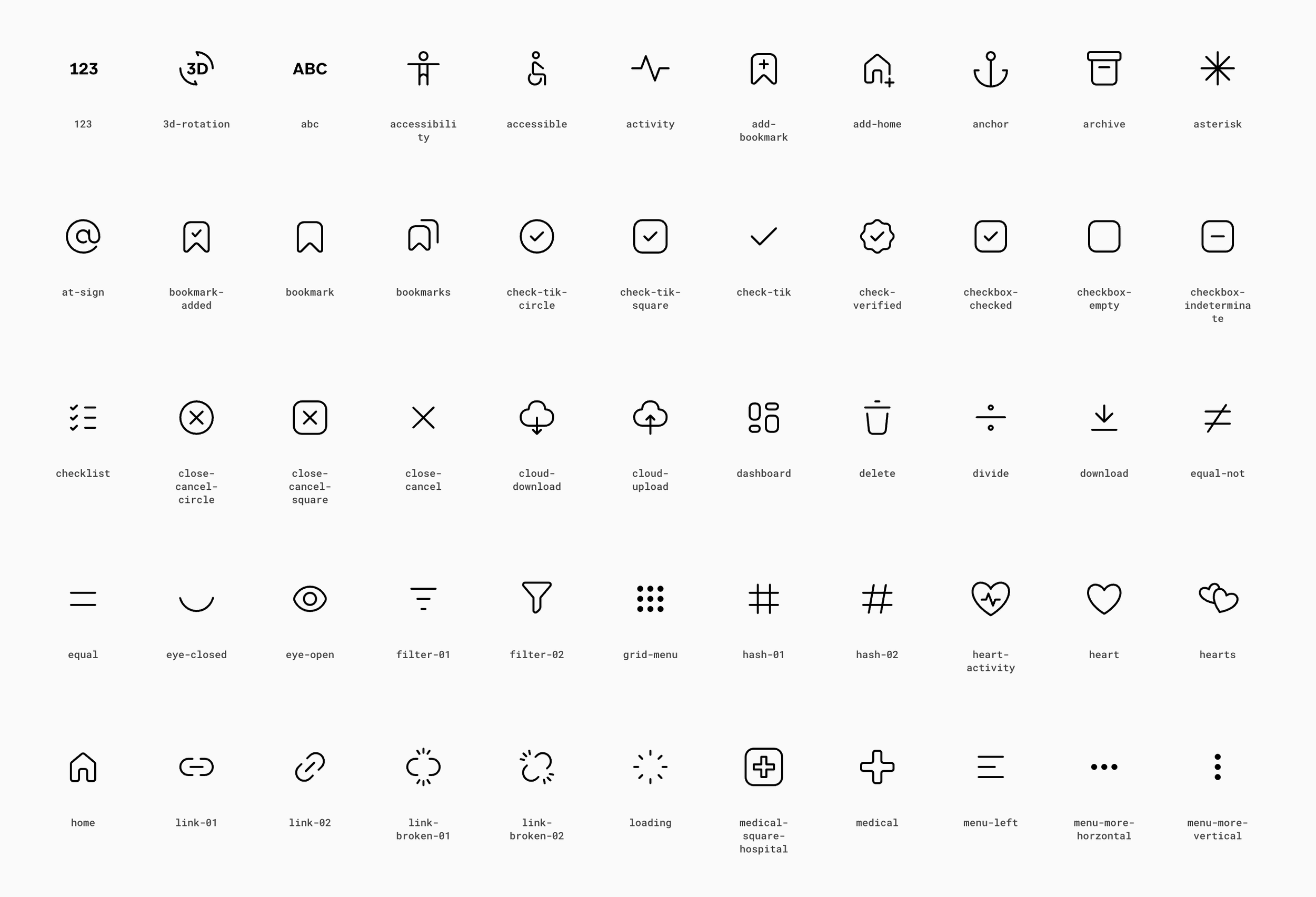
1000+ icons, 4 weights, 18 categories, built to be dropped into any product without breaking consistency.
Why Forma exists
I built Forma for a simple, practical reason, I wanted a library of icons I designed myself, that I could reach for anytime a project needed one, instead of hunting through other people's icon sets or settling for something that almost fits. Making it open source was also a deliberate choice for my portfolio, it's one thing to say you can design a systematic icon library, it's another to put 1000+ icons in front of anyone and let the work speak for itself.
System principles
On the grid:
Every icon in Forma sits on a 24x24 pixel grid. This isn't just a technical constraint, it's what makes 1000+ icons feel like they belong to one family instead of a random collection. The grid keeps stroke widths, corner radii, and optical spacing consistent, so an icon designed on day one and one designed on day 500 still sit comfortably next to each other in an interface.
On weights:
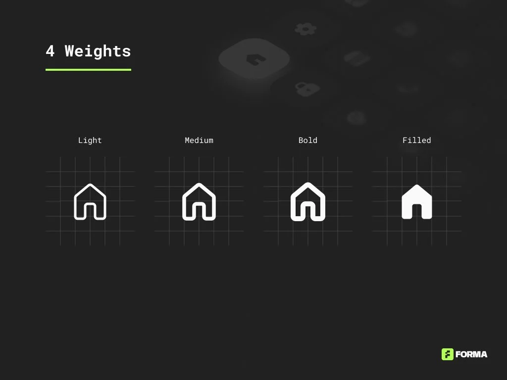
Forma ships in 4 weights, light, medium, bold, and filled, so the same icon can adapt to different contexts. Light works well in dense UI where you don't want visual noise, bold and filled carry more weight for emphasis or active states, and medium sits as the flexible default for most product interfaces.
On categories:
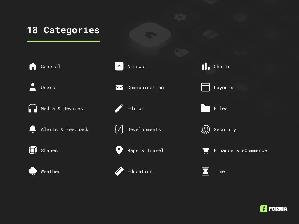
The set is organized into 18 categories, from general and communication icons to finance, maps, and security. The goal was to make a 1000+ icon library actually searchable, so a designer isn't scrolling through hundreds of unrelated icons to find the one they need.
Forma in practice, Bloom dashboard
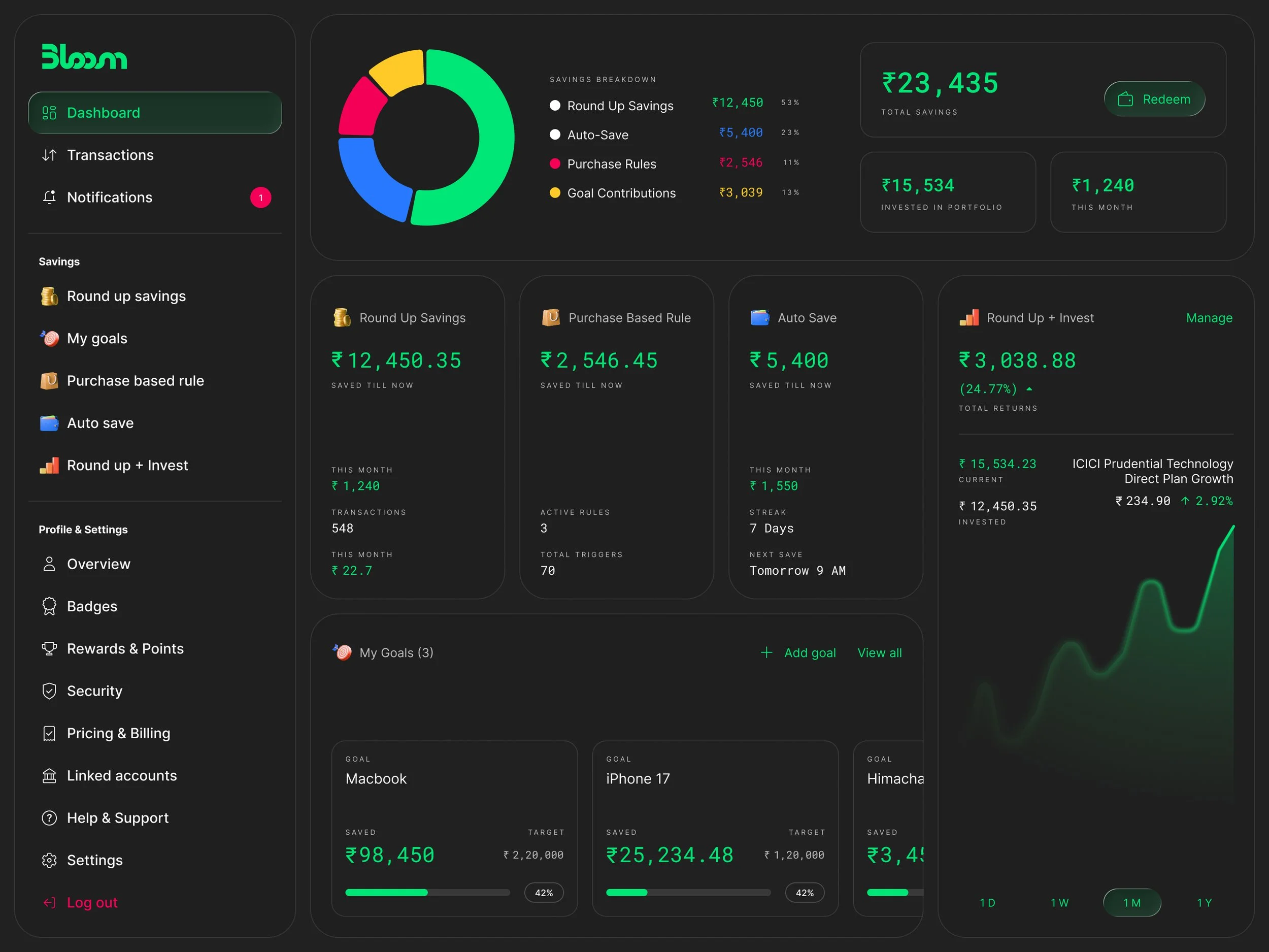
This is Bloom, a micro savings and investment app, and every icon on this screen, from the notification bell and shopping bag to the food, cab, wallet, and transaction icons, comes from Forma. A dashboard like this is a good test for an icon system because it's dense, dozens of small icons sit next to numbers, toggles, and text in a tight grid, and any inconsistency in stroke weight or alignment shows up immediately. Seeing the icons hold up here, at 16 to 20px, next to live data, is a better proof of the system than a static icon sheet ever could be.
Access
Forma System Icon set is open source and free to use in any product design project.
Personal projects
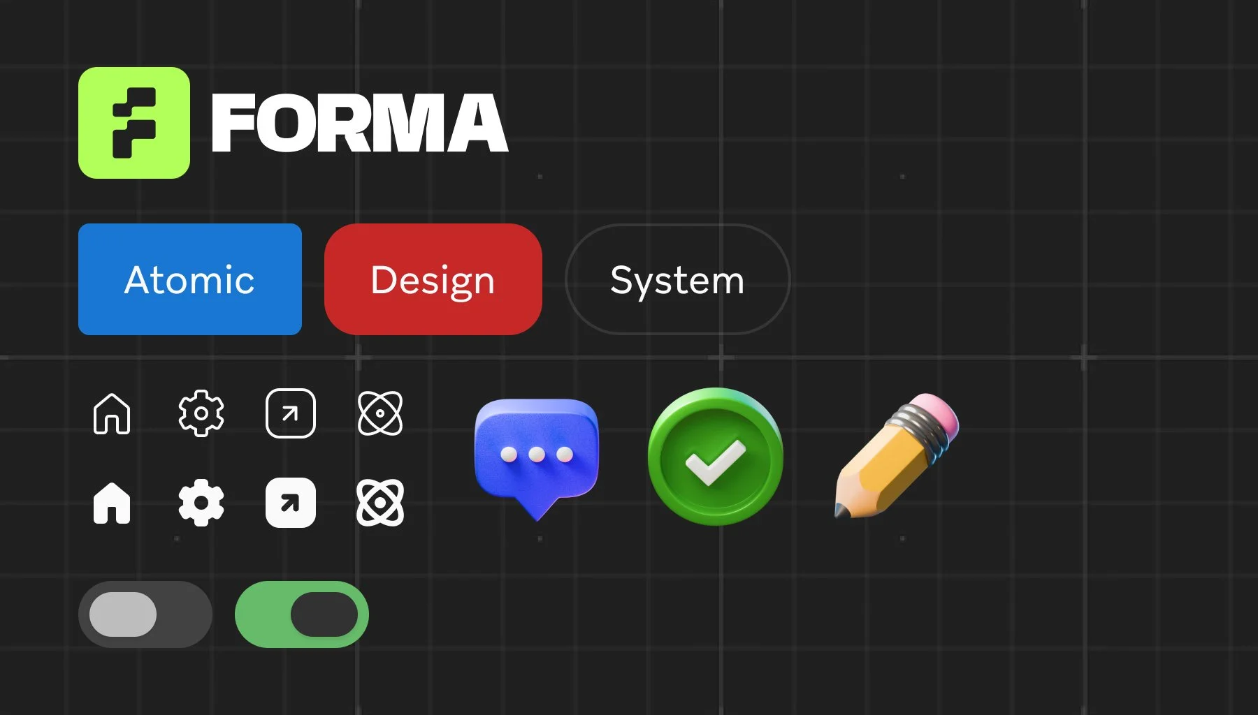
Forma Atomic Design System
Atomic design is a methodology for creating design systems that emphasises breaking down user interfaces into their fundamental components and then assembling them into more complex structures. This approach, proposed by Brad Frost, draws an analogy from chemistry to describe how components can be combined to build up an entire design system.
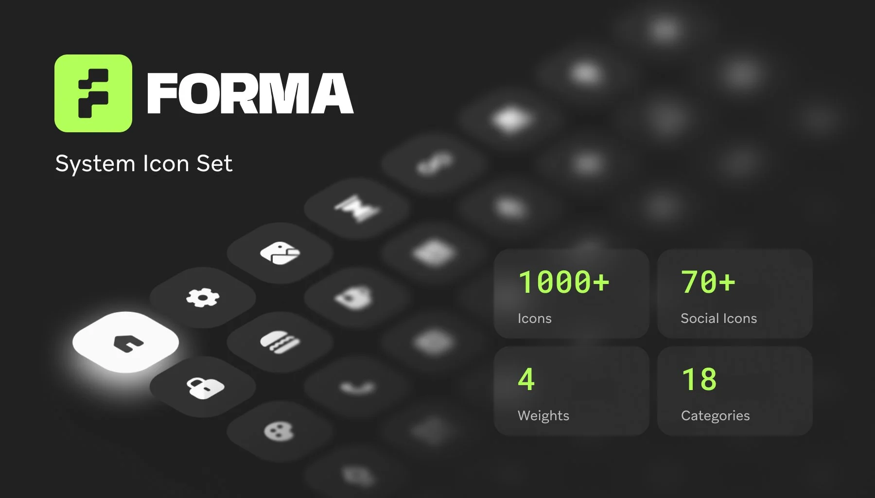
Forma System Icon Set
The Forma Icon Set is a meticulously crafted collection of vector icons designed to enhance digital interfaces with clarity and consistency. Each icon in the set is built on a 24x24 pixel grid, ensuring uniformity and alignment across various applications. The icons feature clean lines and balanced proportions, making them versatile for use in web, mobile, and product design.
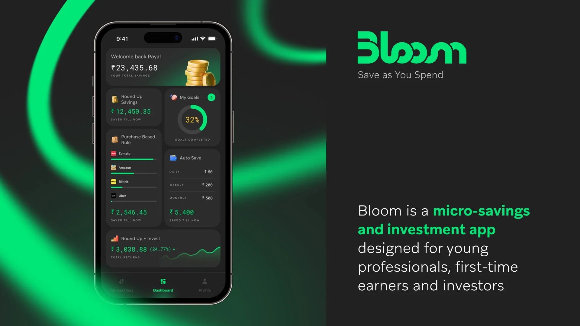
Bloom - Micro-savings App
Bloom is a micro-savings and investment app that helps users build wealth effortlessly. Every time you make a purchase, the app rounds up the spare change and invests it into safe, low-risk funds. Designed for young professionals and first-time investors, Bloom turns small daily transactions into long-term financial growth.